The colours chosen for a logo significantly influence our subconscious perceptions. When you consider that 93% of purchasing judgments are made on visual perceptions, it’s no surprise that colours can subliminally convince prospective clients that your firm is the best choice out there.
To unpack the psychology behind a firm’s colour scheme of choice, 99designs analysed a range of design projects created on the platform to identify the logo colours and brand traits preferred by legal industry clients. We then compared these against the colours that global industry leaders use to figure out what’s going on behind the scenes of some of the world’s biggest firms. Whether it’s giving off an air of quiet sophistication or promoting power, youth and vitality, here’s what the colour of your logo says about your law firm.
Keeping it simple
It makes sense that lawyers want to be perceived as professional, discreet and sophisticated, so it’s no surprise that an austere, minimalist aesthetic features heavily in the logos of leading law firms.
These top firms have a preference for logos with a single dominant colour, and either a neutral secondary colour or no secondary colour at all. When secondary colours are used, they’re usually neutral: think black, whites and greys that let the dominant colour do the talking.
Smaller firms are more willing to experiment with wider and wilder colour palettes, branching out in hues of two or more different shades. For younger or more niche firms this could be a way to communicate a more progressive and modern edge.
Modern classics
Often, there is a tug of war that occurs over how law firms perceive themselves, and how they wish to be perceived by potential clients.
Somewhat contradictorily, firms tend to have a preference for coming across as both classical and youthful. This can, in part, be put down to a desire to impart a sense of modernity amid the years of history and tradition that underpins the legal industry.
The colour red
The relative popularity of red in legal logos may be attributed to a desire to inject a sense of vigor into the staid tradition of the legal profession. Almost one-fifth of 99designs clients and legal industry leaders opt for this vibrant hue in their branding. It’s a passionate colour, and one often associated with youth and vitality. It’s also a colour signifying power and carrying connotations of strength and victory: a suitable signifier for the adversarial nature of the legal profession.
Blue is the professional’s choice
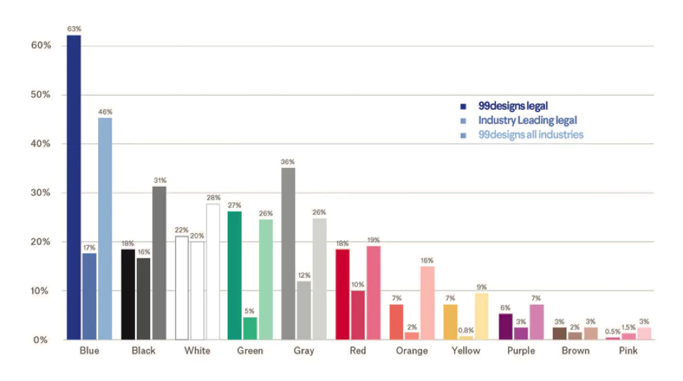
Among 99designs’ legal clients, blue comes out as favourite making an appearance in 63% of legal logos. Light blue signifies trust and dark blue represents professionalism, so it’s little wonder that this colour palette is popular with firms looking to add a touch of sophistication and credibility to their operations.
However, blue isn’t just the most popular logo colour choice for legal clients – it is a favourite among all industries.
The below graph compares the most popular law firm logo colours among 99designs’ legal clients, legal industry leaders and across all industries.
Data visualizations designed by MH Designs.
The colour black
Black is another popular choice: present in just under a fifth of legal logos. The colour is sleek, modern and commanding: everything a top-tier firm should be.
The colour green
Green is another popular choice, appearing in over a quarter of legal logos created on 99designs. It’s a versatile colour that is vibrant and youthful, but still signifies growth, rebirth and prosperity.
Choosing the right colour for your firm
So now that you understand the importance that colour plays in the perception of your firm, how will you create a logo that fits with the image you want to portray?
The design and colour scheme of your logo will come down to your firm’s unique personality and brand.
If your brand veers towards masculine rather than feminine, colours like brown and dark blue will reflect this to prospective clients. If you’re looking to hit a serious tone in your branding, consider colours like blue and black to give your firm a sense of gravitas. These colours also project luxury and sophistication. If you’re looking to appeal to a mature market, dark blue is a no brainer.
If you seek to inject a sense of freshness and modernity into your firm’s culture, opt for green hues. However, if you want to stand out from the crowd, a powerful, red will convey power, energy and vitality.
In an industry that favours rationalism and reasoning over impulse and intuition, even the simplest logo has the powerful ability to appeal to the subconscious emotional responses of other legal industry players, as well as future clients. Intentionally or not, your law firm’s logo speaks volumes about how your firm is perceived, and it is a decision that should be made with care.